As our product evolved and our visual identity started to take shape, we faced a growing need for consistency — in our UI, our workflows, and our handoff process. Design was starting to feel fragmented. Each product page, component, or flow was being styled in isolation. We needed a system — something foundational, scalable, and true to the brand we were building from the ground up.
Client
Vizible Labs
DELIVERABLES
Design tokens, UI components, Design system
Year
2024
Role
Product Designer
🔍 Research & Insights
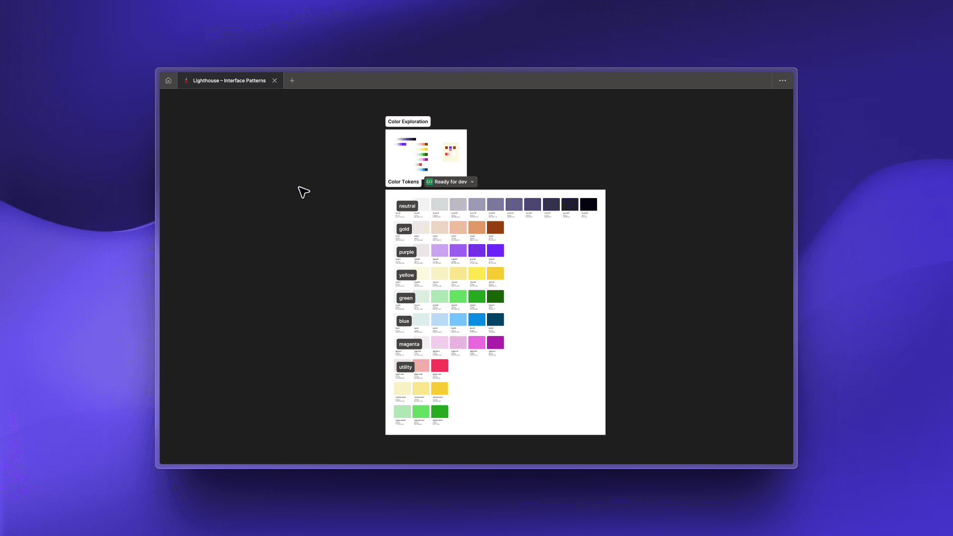
To begin, we asked foundational questions: How do we want users to perceive our brand through UI? What visual principles do we want to consistently apply? What core components do we need to scale product development? We focused our discovery around color, typography, and component usage — the first layer of alignment between product and brand. We also conducted internal audits of previous UI work to identify duplication, inconsistencies, and design debt.
🧱 Design Strategy
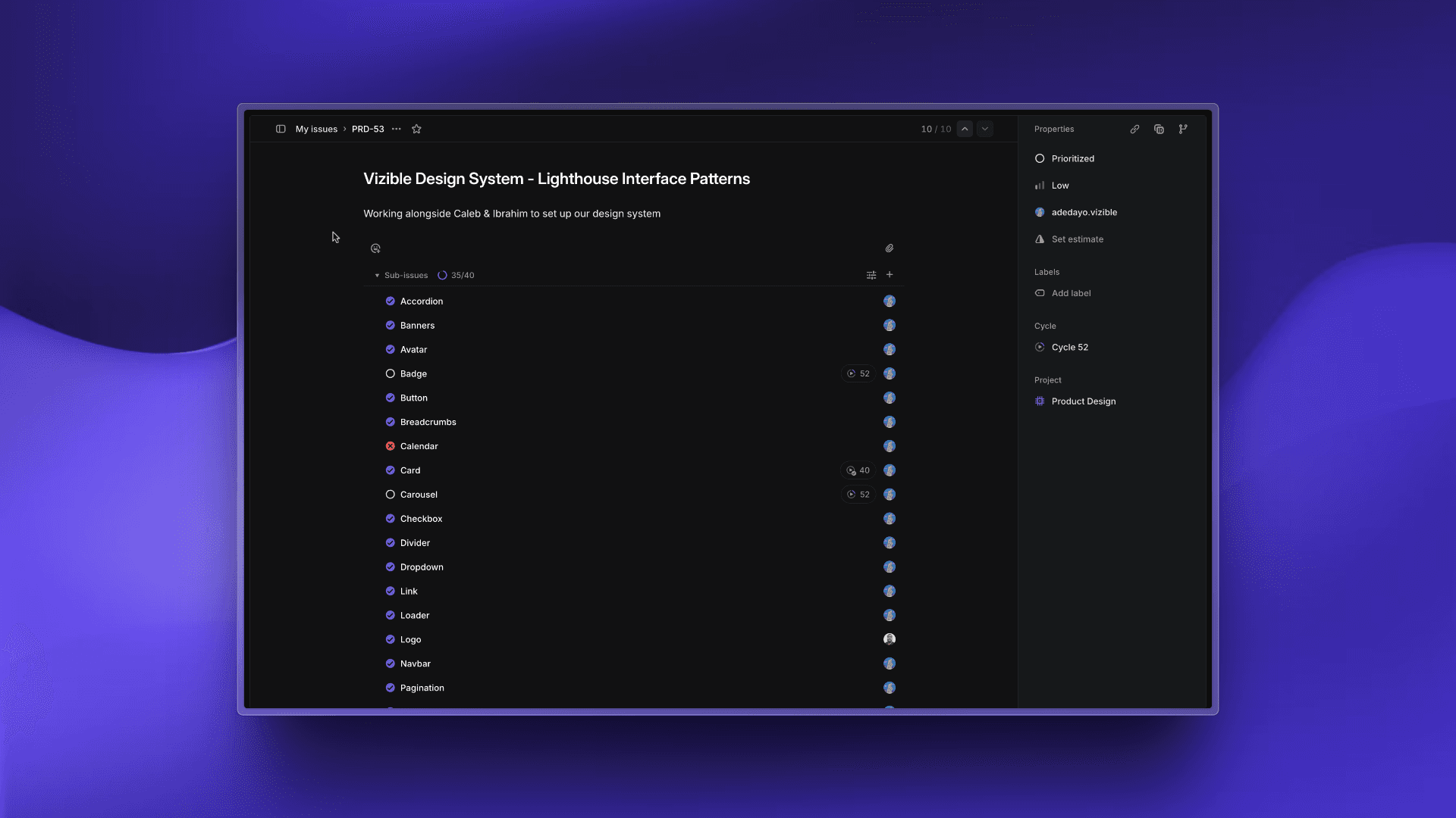
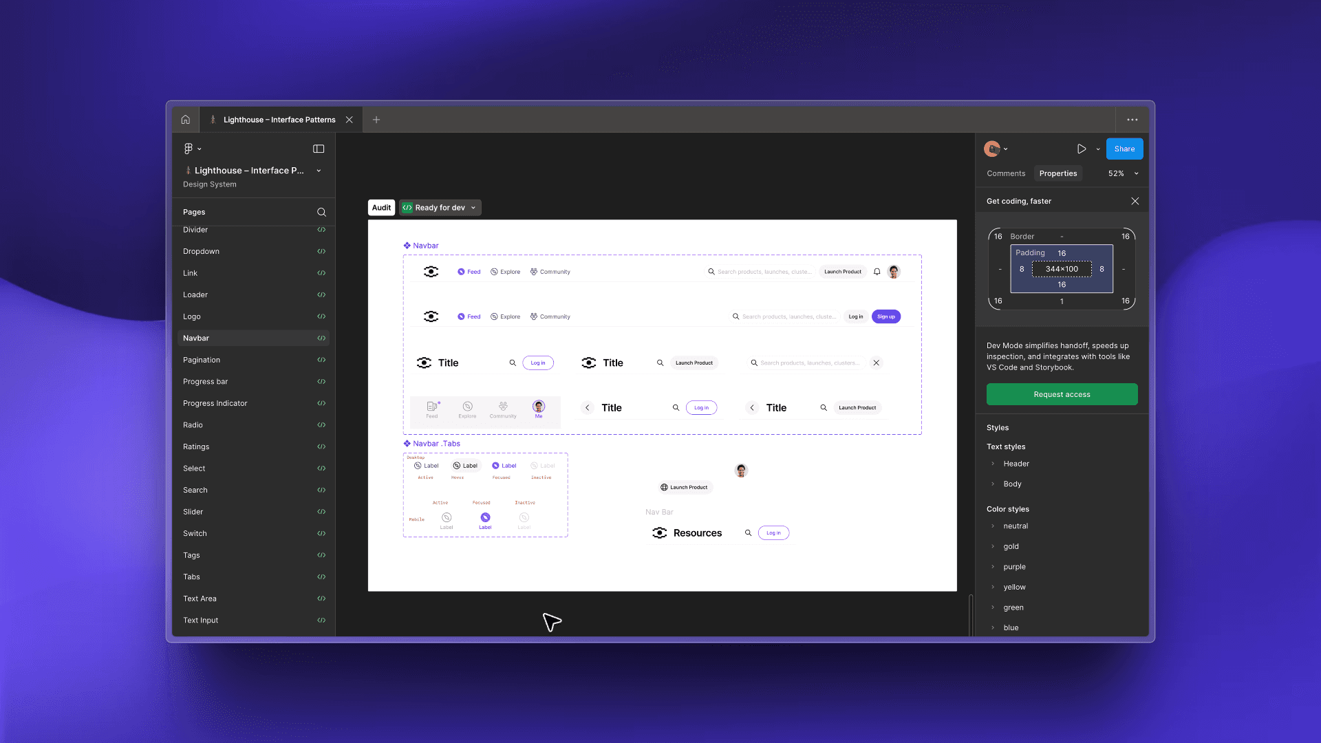
We approached the system in four layers: • Linear-based planning: We created a task list of every essential component — from typography tokens to UI primitives. • Isolated component development in Figma: Each component had its own dedicated page. Here, we explored edge cases, visual variants, and accessibility constraints. Each iteration was documented with notes for dev handoff. • Changelog-based iteration: Design was never final on first pass. As we tested components in real product work, we made adjustments and logged every change for developers. • Front-end sync: We collaborated closely with engineering via Storybook and Chromatic to ensure pixel-perfect implementation and QA alignment.
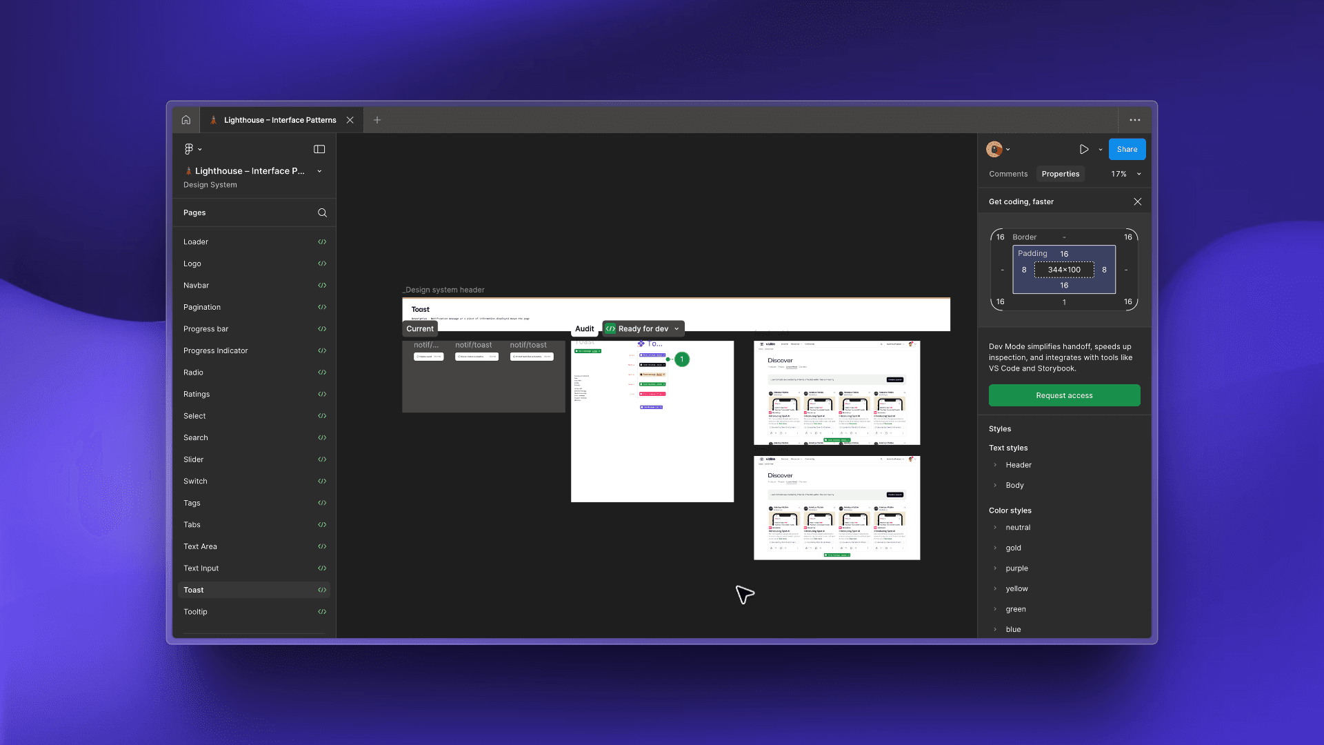
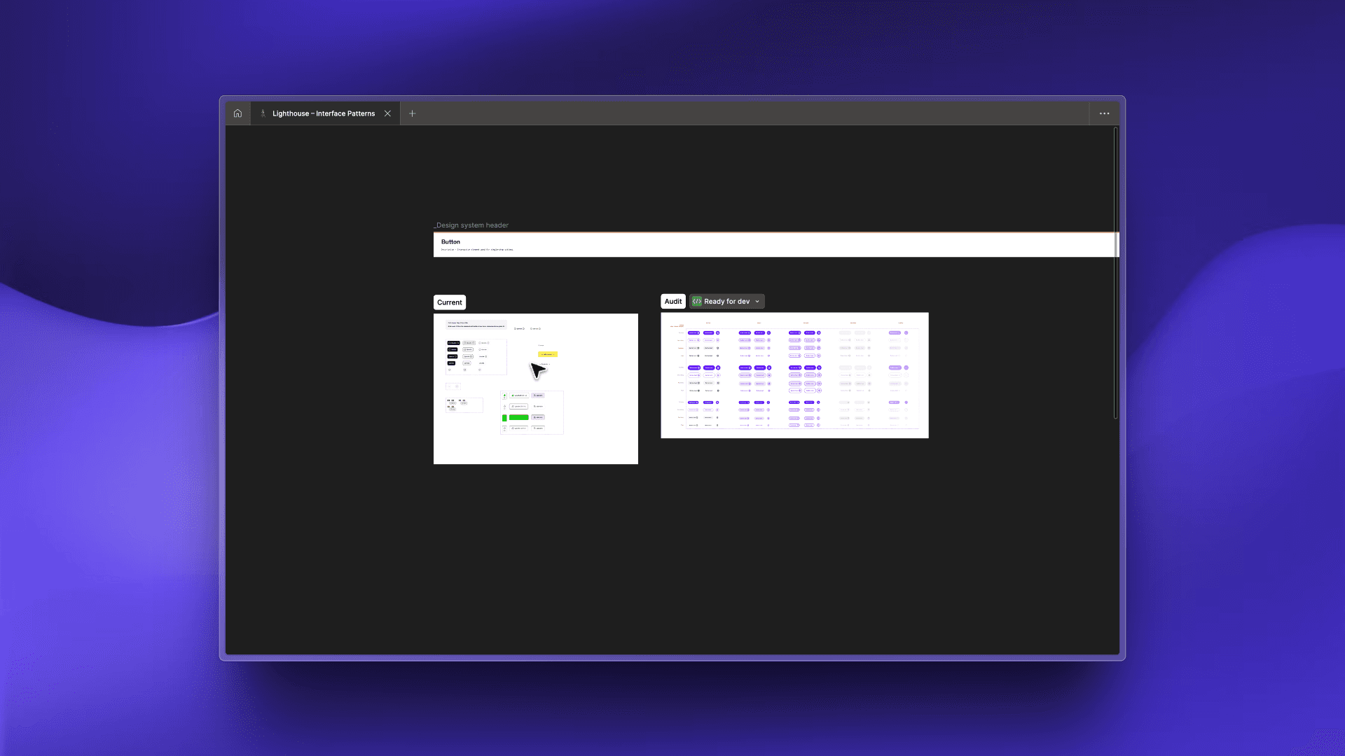
🎨 Design Prototyping
Each component had its own Figma page, where we designed, tested, and annotated for dev. We started with: Typography tokens and scales Color system: primary, semantic, and neutral tokens Primitives: buttons, inputs, modals, tabs, etc. We collaborated with the dev team to preview live implementations via Storybook and Chromatic, which allowed for early detection of spacing, hover, and state discrepancies. We also maintained a running changelog to ensure updates were communicated clearly across design and engineering.
🧪 Testing & Iterations
As we began integrating components into the product redesign, we discovered areas for improvement: Components didn’t always scale across layouts — we refactored width constraints and padding behavior Visual edge cases (e.g. dark mode, mobile stack breakpoints) prompted additional variants Designers flagged friction in reusing components — we refined naming and usage examples Each change was documented and tested again to ensure it aligned with both dev implementation and the design system’s evolving logic.
🚀 Outcome
The system continues to grow — but it’s already become the cornerstone for how we design, build, and scale as a team.